
Ultimate Guide to Mobile Footer Optimization
Best practices for designing crawlable, touch-friendly mobile footers: concise links, 44×44 tap targets, lightweight scripts, and testing.
Mobile footers are often overlooked but play a critical role in user experience and SEO. A poorly designed footer can frustrate users, hurt conversions, and negatively impact your search rankings. Here's what you need to know:
Why it Matters: 70% of websites struggle with footer design issues that harm usability and SEO.
Key Differences: Desktop footers use multi-column layouts, while mobile footers need single-column, touch-friendly designs.
Best Practices:
Use concise content with 5–25 essential links.
Ensure tap targets are at least 44×44 pixels.
Group links into clear categories like "Support" or "Legal."
Use collapsible sections for footers with many links.
SEO Tips:
Include crawlable HTML for all links.
Use descriptive anchor text to help search engines.
Keep JavaScript and heavy animations minimal to improve load times.
Testing: Regularly test on devices, check accessibility, and analyze user interaction data to refine your footer.
A well-optimized mobile footer improves navigation, builds trust, and supports SEO efforts. Focus on simplicity, usability, and performance for the best results.
The Perfect Footer on Tablet and Mobile
The Role of Mobile Footers
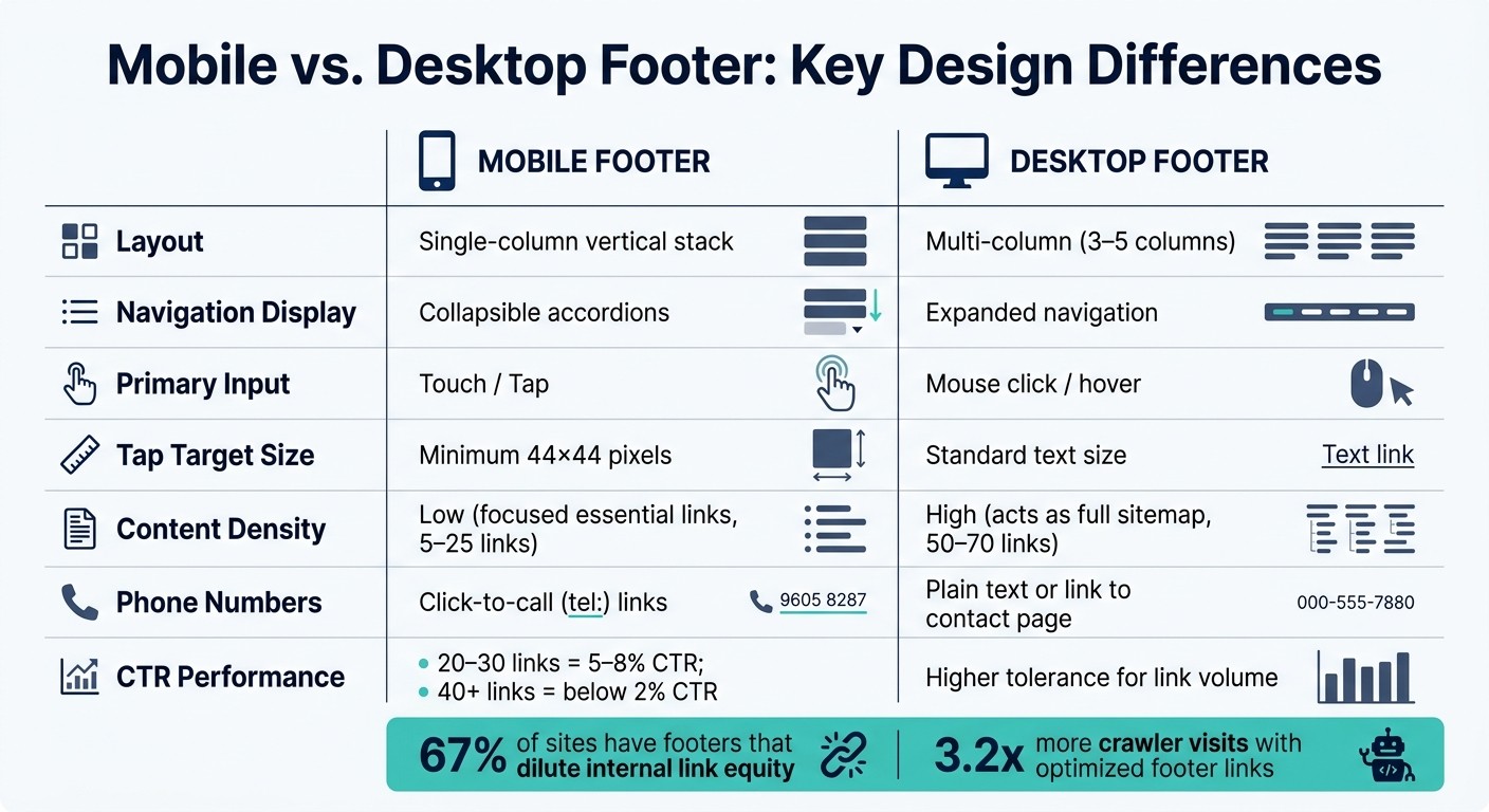
Mobile vs Desktop Footer: Key Design Differences
Mobile footers do more than just collect links - they serve as a crucial element for user navigation, trust-building, and aiding search engines in understanding your site. They’re a small but powerful part of your mobile experience.
Key Functions of Mobile Footers
Think of the mobile footer as your website’s safety net. If users scroll all the way down without finding what they need, the footer becomes their go-to resource for reorienting themselves.
"The footer is the place users go when they're lost. If we want to leave a lasting good impression, it's critical that we don't neglect the bottom of the page." - Therese Fessenden, Senior UX Specialist, Nielsen Norman Group
Footers also carry practical weight for your business. They include legal links - like Privacy Policy or Terms of Service - necessary for compliance with laws like CCPA. They often house contact information, trust indicators (like security badges), and conversion elements such as newsletter signups or click-to-call buttons. For local businesses, ensuring accurate Name, Address, and Phone (NAP) details in the footer can improve local SEO rankings.
From an SEO perspective, footer links appear across all pages, giving them a lot of influence. Sites with optimized footer links see search engine crawlers visit their pages 3.2 times more often. Additionally, well-structured footer links can result in an 18% ranking boost for targeted pages.
Given these important roles, mobile footers need thoughtful design tailored to how users interact on smaller screens.
How Mobile and Desktop Footers Differ
Mobile footers aren’t just smaller versions of desktop footers. They’re designed for entirely different user behaviors, primarily shaped by screen size and touch-based navigation. While desktop footers often spread content across 3–5 columns, this layout doesn’t translate well to mobile, where space is limited and users rely on tapping instead of clicking.
Here’s how mobile and desktop footers compare:
Feature | Desktop Footer | Mobile Footer |
|---|---|---|
Layout | Multi-column (3–5 columns) | Single-column vertical stack |
Navigation display | Expanded navigation | Collapsible accordions |
Primary input | Mouse click / hover | Touch / tap |
Tap target size | Standard text size | Minimum 44×44 pixels |
Content density | High (acts as full sitemap) | Low (focused essential links) |
Phone numbers | Plain text or link to contact page | Click-to-call ( |
The way users interact with mobile footers is fundamentally different. Desktop users can click on small links with precision, while mobile users tap with their fingers - often one-handed and on the go. That’s why tap targets need to be at least 44×44 pixels, with 8–12px spacing between links to avoid accidental taps.
Content curation is equally important. While a desktop footer can comfortably display 50–70 links without overwhelming users, a mobile footer needs to stay concise. Research shows that footers with 20–30 links perform best, achieving click-through rates of 5–8%. In contrast, footers with 40+ links see CTRs drop below 2%. The takeaway? Focused, streamlined footers are far more effective.
Recognizing these differences is key to optimizing mobile footers for better usability and performance.
What to Include in a Mobile Footer
Must-Have Elements for Mobile Footers
A mobile footer isn’t just an afterthought - it’s a critical space where every element should serve a purpose. Whether it’s helping users navigate, building trust, or meeting legal requirements, every link and detail should earn its place. Anything that doesn’t? It’s clutter.
Element Category | What to Include | Why It Matters |
|---|---|---|
Legal/Compliance | Privacy Policy, Terms of Use, Cookie Settings | Meets CCPA/GDPR compliance standards |
Contact | Click-to-call phone ( | Simplifies mobile contact and boosts local SEO |
Navigation | About Us, Careers, Support, FAQs | Helps users find secondary but important info |
Trust | Copyright © 2026, certifications, review links | Instantly adds credibility |
Conversion | Newsletter signup, primary CTA | Encourages users to act before leaving |
For smaller websites, aim for 5–8 links in your footer. Larger websites can go up to 15–25 links, but keep it concise. Overloaded footers tend to underperform on mobile.
Here’s a pro tip: make sure your business name, address, and phone number match your Google Business Profile exactly. Even tiny inconsistencies - like “Ave.” versus “Avenue” - can negatively impact your local search rankings.
Once the essentials are in place, focus on cutting out anything redundant or unnecessary. A streamlined footer makes for a better mobile experience.
How to Reduce Footer Clutter
With your must-have elements identified, it’s time to declutter. Ask yourself for each link: “Does the user need this here?” If the answer is no, get rid of it. For links you’re unsure about, move them to your main navigation or a dedicated page.
"The footer might be the last thing on the page, but it can be a quiet indicator of a team's UX maturity." - Darina Silchenko, Senior UI/UX Designer, Eleken
For mobile footers, group links into four clear categories: Products/Services, Company, Resources, and Legal/Compliance. This makes it easy to spot when a category is overloaded. Use specific labels like “Support” or “Help Center” instead of vague ones like “Resources.” To keep things compact, implement collapsible sections. Users can tap to expand only what they need, reducing visual clutter and improving usability. This also helps with faster load times - always a win on mobile.
One final note: 67% of sites audited in April 2026 had footers that diluted internal link equity. Overloaded footers don’t just frustrate users - they can also confuse search engines about your site’s structure. Keeping your mobile footer lean isn’t just about design; it’s a smart SEO move too.
Mobile Footer Layout Patterns That Work
When designing mobile footers, combining essential elements with reduced clutter can significantly improve usability. Let’s explore some effective layout strategies.
Single-Column and Grouped Layouts
On mobile screens, a vertical layout is your best bet. Horizontal scrolling can frustrate users and make navigation cumbersome, so avoid it entirely.
Once stacked, organize links into 3–5 categories like "Support", "Company", "Services", and "Legal." Grouping links by user intent makes it easier for users to find what they need quickly, reducing cognitive effort. Research shows that footers with well-organized link groups tend to see higher click-through rates. For each group, include 4–8 links and place the most important contact or navigation options at the top for better visibility.
This structure creates a solid foundation for the next level of space-saving techniques.
Collapsible Sections for Space Management
If your footer contains 30 or more links, collapsible accordion-style sections can keep the design clean and manageable. These sections allow users to tap on high-level categories to reveal more options.
"Accordion footers are acceptable, but links must remain in the HTML and be crawlable." - Southern Digital Consulting
It’s crucial that collapsed links are present in the raw HTML and not dynamically added with JavaScript, as search engines may struggle to index them. Use bold H2 or H3 headers for toggles, ensuring tap targets are at least 44×44 pixels to prevent accidental clicks. Additionally, use CSS to reserve space for these elements, avoiding Cumulative Layout Shift (CLS), which can negatively impact user experience and your Core Web Vitals scores.
Spacing and Visual Hierarchy
Proper spacing and typography are essential for mobile footers. Use a font size of at least 14–16px to make text easily readable without zooming. Maintain 8–12px of vertical spacing between links to ensure users can tap accurately. Bold headers and consistent spacing create a clear visual hierarchy, helping users navigate more efficiently.
For accessibility, wrap the footer in a <footer> element with role="contentinfo", and use <nav> tags to define link groups. This makes the footer more user-friendly for screen readers.
Up next, we’ll dive into the technical details that support these design principles.
Technical Setup for Mobile Footer Optimization
Using Crawlable HTML and Lightweight Markup
Creating an effective mobile footer starts with clean, well-organized HTML. Use a <footer> element with the role="contentinfo" attribute to define the section. Inside it, include <nav> elements with clear aria-label attributes, such as "Secondary Navigation", to group related links. For the links themselves, structure them using <ul> lists within each group.
Why is this important? Google primarily relies on the mobile version of your site for indexing. If your footer links are added dynamically through JavaScript after the page loads, they might be invisible to search engine crawlers. Even if you use collapsible accordion-style sections, ensure that all links are present in the raw HTML source. This isn't just about good design - it’s essential for search engine visibility.
When adding links, use descriptive anchor text like "Contact Us" or "Privacy Policy." These phrases provide search engines with clear context and make navigation straightforward for users.
"Internal links are one of the most powerful tools you have for communicating page importance to Google - and the footer is the highest-leverage placement on your entire site." - Jordan Mercer, Senior SEO Strategist
Reducing Script Overhead in Footers
Once you've nailed the HTML structure, it's time to focus on optimizing scripts in the footer. Heavy JavaScript is a common culprit behind slow mobile performance. Features like chat widgets, social media embeds, and analytics tools often load in the footer, but they can block the main thread and negatively impact your Interaction to Next Paint (INP) score, a key Google ranking factor as of March 2024.
To avoid this, aim to keep the total JavaScript payload in the footer under 50KB, with 25KB being the ideal target for better Core Web Vitals performance. Use the defer attribute for any footer-specific scripts, and for images like logos or trust badges, apply loading="lazy" along with explicit width and height attributes. This helps prevent layout shifts and improves the Cumulative Layout Shift (CLS) metric.
"If your footer loads third-party scripts (chat widgets, social embeds, analytics pixels) that block the main thread, you may be sacrificing Core Web Vitals scores on every page of your site." - SEOAuthori Blog
For social media links, skip the embedded widgets. Instead of embedding a live Instagram feed, provide a static link to your profile. It delivers the same navigation value without the performance drag.
1Footer for Multi-Site Footer Management

If you're managing multiple websites, keeping footers consistent can be a real challenge. A legal link might be updated on one site but not the others. A copyright year might get overlooked. Or a broken link could sit unnoticed for months. These aren't just minor annoyances - they can dilute link equity and create compliance risks.
That’s where 1Footer comes in. This tool lets teams manage a single footer and push updates across multiple domains simultaneously. Every update is delivered as crawlable HTML, ensuring search engines can reliably index the footer links on all your sites without needing to render JavaScript.
Manual Multi-Site Management | 1Footer Management | |
|---|---|---|
Update Speed | Slow (site-by-site) | Instant (one-click publish) |
Consistency | High risk of human error | Guaranteed across all domains |
Crawlability | Depends on local implementation | Built-in crawlable HTML delivery |
Platform Support | Manual coding required | Framer, HubSpot, Cloudflare, etc. |
Daniel Sinewe, an indie hacker who uses 1Footer, explains its value perfectly: "1Footer exists because I got tired of manually updating footers across all my indie projects every time I launched something new." For teams juggling legal disclosures, privacy links, or navigation updates across multiple websites, centralized control isn’t just helpful - it’s essential.
How to Test and Refine Mobile Footers
Testing Across Devices and Screen Sizes
Once you've optimized your mobile footer's design and functionality, ongoing testing is the key to making sure it stays user-friendly. Test it on actual iOS and Android devices to catch any touch interaction problems. For example, a link that looks fine in a desktop browser might be tricky to tap on a real phone.
You should also run an accessibility audit. This ensures your footer works at 200% zoom, supports keyboard navigation with Tab/Shift+Tab, and is properly interpreted by screen readers like VoiceOver or Narrator.
Before going live, make sure your footer meets these criteria:
Test Category | What to Check | Pass Criteria |
|---|---|---|
Functionality | Link status, redirects, CTAs | 200 OK, no 404 errors |
Usability | Tap targets, font size, spacing | 44×44px targets, 16px+ font, 8px+ spacing |
Accessibility | Screen readers, keyboard nav, zoom | WCAG 2.1 AA, supports 200% zoom |
Performance | JS payload, CLS, INP scores | JS under 50KB, no layout shifts |
SEO | Anchor text, crawlability | Natural anchor text, valid HTML |
Once you've confirmed these technical and accessibility requirements, it's time to review how users interact with the footer to uncover areas for improvement.
Using Interaction Data to Spot Problems
Device testing is just the start - interaction analytics can reveal how users are actually engaging with your footer. Post-launch data offers insights into real-world behavior. For instance, heatmaps can show how far users scroll and which footer elements get the most attention. Meanwhile, session recordings can highlight moments of frustration, like users repeatedly tapping on a link that's too small or too close to another element.
Track click-through rates (CTR) for individual footer links to see if the data matches your expectations. Links with little to no engagement might be unnecessary and could be removed.
"Footers act as a 'safety net' for users who reach the end of a page without finding what they needed." - Nielsen Norman Group
A Step-by-Step Refinement Process
Once you've tested and analyzed user interactions, it's time to refine your mobile footer. Follow an iterative process to make improvements. Start by running a crawl audit using tools like Screaming Frog. This will help you extract all footer links across your site and confirm that every link is functional - no 404 errors or unnecessary redirects. Next, check for diverse anchor text to avoid over-optimization, and conduct a performance audit to keep your JavaScript payload under 50KB.
After that, revisit your interaction and accessibility data to identify further tweaks. When you're ready to implement changes, do it gradually rather than all at once. Small updates make it easier to measure the impact of each adjustment, whether it's a drop in bounce rate, a better INP score, or higher click-through rates for footer links. Aim to repeat this process monthly to catch and resolve issues before they escalate.
Conclusion and Key Takeaways
This guide has explored the essential design and technical strategies for crafting effective mobile footers. A well-thought-out mobile footer improves navigation, boosts SEO, builds trust, and enhances overall site performance. Prioritize key elements like clear tap targets, readable fonts, and lightweight scripts to ensure better engagement and search visibility. Every detail, from layout to legal compliance, contributes to creating a seamless user experience.
"The footer is often undervalued in mobile design, but with thoughtful implementation, it powerfully enhances user experience and brand credibility." – Lite14
Streamlined footers consistently outperform cluttered ones. Keeping your footer simple and focused leads to higher click-through rates, while overloaded designs tend to drive users away. The takeaway? Less is more. Remove unnecessary links, use clear and descriptive anchor text, and steer clear of redirect chains.
Consistency is another critical factor, especially if you're managing multiple sites. For example, updates to privacy policies or product links need to be reflected across all domains. Tools like 1Footer simplify this process by synchronizing legal and navigation links across sites, eliminating manual updates while maintaining crawlable HTML. This approach transforms the footer into a dynamic, reliable asset for your site.
To keep your footer performing at its best, schedule regular audits and user testing. Test functionality on actual devices, analyze interaction data, check for broken links, and make small, incremental improvements. A tidy, fast, and consistent footer creates a lasting positive impact on both user experience and site performance.
FAQs
Which footer links matter most for mobile SEO?
Footer links play a big role in mobile SEO by distributing authority to important pages on your site. Focus on linking to high-impact pages like landing pages that drive conversions, product categories, and critical service pages. These links help direct both users and search engines to the most valuable parts of your site.
Don’t forget utility pages like your contact information, privacy policy, and terms of service. Including these not only builds trust with visitors but also ensures you're meeting legal requirements.
For the best results, use descriptive, keyword-rich anchor text that clearly communicates what each link is about. Even if you're using accordions to save space on mobile screens, make sure the links are embedded in crawlable HTML so search engines can easily access them.
How do I keep accordion footer links crawlable?
To make sure accordion footer links remain crawlable, ensure they are present in the initial HTML and not obscured by client-side interactions. Since search engine bots can't interact with pages like humans do, avoid using JavaScript to dynamically add links to the DOM. Instead, rely on server-side rendering to include these links from the start. Tools such as 1Footer can assist in delivering consistent and crawlable HTML across all your sites.
What’s the fastest way to update footers on multiple sites?
The fastest way to update footers across several sites is by using 1Footer, a tool designed specifically for teams managing multiple websites. With 1Footer, you can centralize your footer content, allowing you to make a single update that instantly applies to all linked domains. This keeps your legal links, navigation, and other elements consistent across sites while retaining crawlable HTML - no need for tedious manual updates on each individual site.


