
Checklist for Mobile Footer Accessibility Compliance
Accessible mobile footers are essential — follow a checklist for semantic HTML, responsive design, touch targets, contrast, and legal links.
Mobile footer accessibility is non-negotiable. It ensures users - including those with disabilities - can navigate critical links like privacy policies and contact information on mobile websites. Here’s what you need to know:
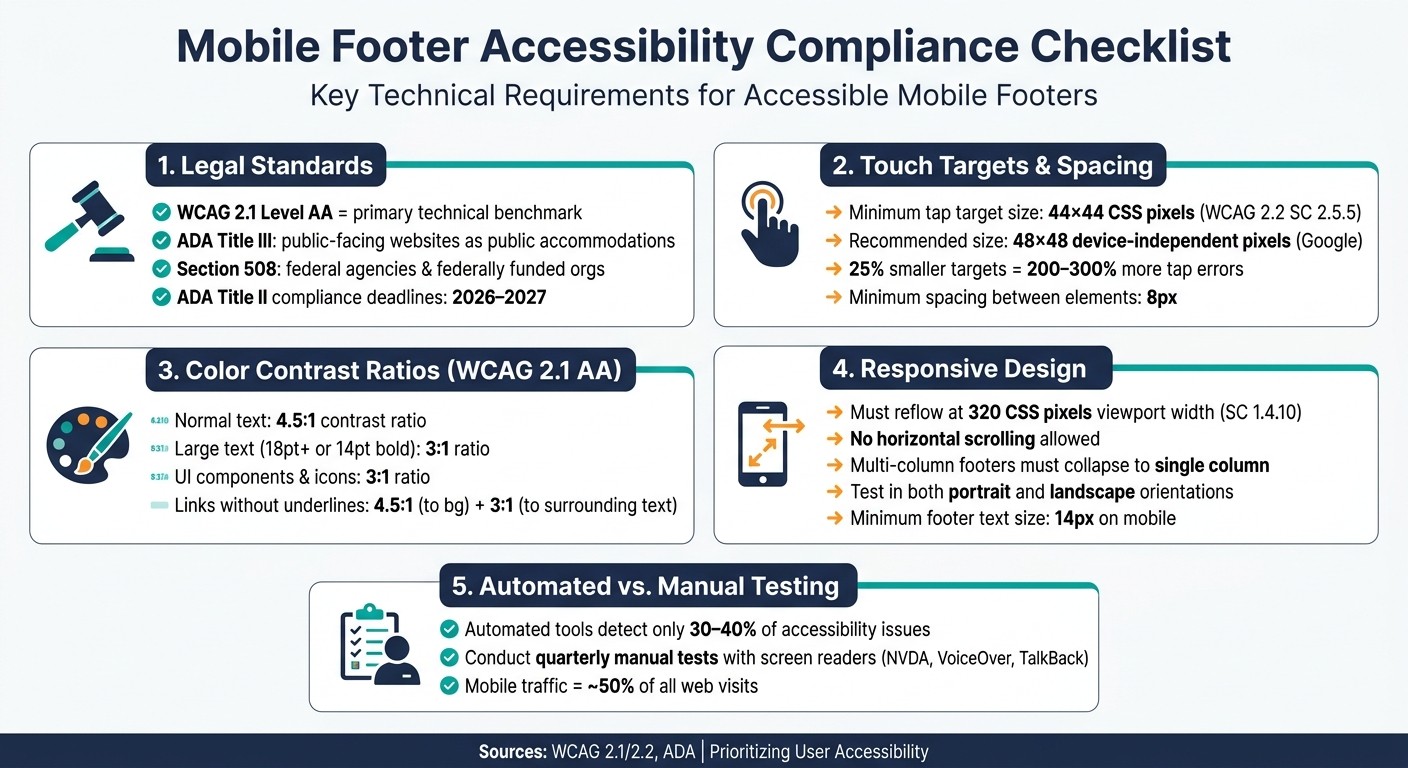
Legal Standards: In the U.S., WCAG 2.1 Level AA is the benchmark for ADA and Section 508 compliance.
Semantic HTML: Use proper
<footer>tags and ARIA roles for screen reader compatibility.Responsive Design: Test footers across screen sizes to avoid clipping or horizontal scrolling.
Touch Targets: Minimum size of 44x44 pixels with at least 8px spacing between elements.
Color Contrast: Maintain a 4.5:1 ratio for text and 3:1 for UI components.
Legal Links: Include accessible links to Privacy Policy, Terms of Use, and Accessibility Statement.
Tools like 1Footer can simplify updates across multiple sites. Regular manual testing with screen readers is also essential for filling gaps missed by automated tools.
Mobile Footer Accessibility Compliance Checklist: Key Standards at a Glance
Tap swipe hear: A guide to mobile accessibility and screen readers | Webinar
Core Standards and Legal Requirements for Mobile Footers
Understanding the rules and best practices for mobile footers is key to ensuring both legal compliance and a user-friendly experience. Below, we'll break down the essential accessibility standards, semantic structures, and responsive design strategies that make mobile footers effective and inclusive.
Confirm Which Accessibility Standards Apply
In the U.S., mobile footer accessibility is guided by three main frameworks. WCAG 2.1 Level AA is the primary technical standard, addressing mobile-specific issues like Reflow (1.4.10) and Orientation (1.3.4), which dictate how footers should behave on smaller screens. Meeting WCAG 2.1 Level AA often fulfills the requirements of ADA and Section 508 as well.
ADA Title III: Requires public-facing websites to be accessible, treating them as public accommodations.
Section 508: Mandates that federal agencies and organizations receiving federal funding deliver accessible content.
ADA Title II: Public entities must meet explicit compliance deadlines for mobile web content by 2026 and 2027.
Once you've identified the relevant legal requirements, the next step is to implement an accessible semantic structure.
Use a Semantic Footer Structure
Adopting proper HTML elements not only improves usability but also supports assistive technologies. Use the <footer> element instead of a generic <div> to define the footer. When the <footer> is a direct child of <body>, it automatically assumes the ARIA landmark role of contentinfo, enabling screen reader users to navigate directly to it.
Here are a few key points to keep in mind:
Limit to One
contentinfoLandmark: Each page should have only one primary footer landmark.Label Navigation Groups: If your footer contains separate sections (e.g., "Legal" and "Social" links), assign clear
aria-labelattributes to each<nav>element for better differentiation.Add Compatibility Features: Use
role="contentinfo"to ensure support in older Safari versions.
This attention to semantic structure makes footers easier to navigate for all users, including those relying on screen readers.
Test Responsive Design Across Mobile Screen Sizes
Ensuring a footer's responsiveness is critical for accessibility. WCAG Success Criterion 1.4.10 requires that content reflows at a viewport width of 320 CSS pixels without causing horizontal scrolling. This size represents the most challenging reading experience for low-vision users - similar to viewing a 1,280px desktop page at 400% zoom.
"A layout that reflows for low-vision desktop zoom also serves small screens without a separate codepath." - a11ybot
To test this, simulate different screen sizes by resizing or zooming. Check that:
Multi-column footers collapse into a single column.
No content is clipped or cut off.
Horizontal scrollbars do not appear.
Additionally, test the footer in both portrait and landscape orientations. Avoid locking orientation, as this can create barriers for users with fixed or mounted devices. By ensuring a seamless experience across screen sizes and orientations, you'll improve usability for all users, including those with low vision or mobility challenges.
Touch Targets and Spacing for Mobile Footer Interactions
When designing a mobile footer, it’s crucial to make every element easy to tap on touchscreens. Small, crowded links can lead to frustrating experiences, especially for users with accessibility needs.
Set a Minimum Tap Target Size
According to WCAG 2.2 Success Criterion 2.5.5, interactive elements should be at least 44 x 44 CSS pixels in size. Google and web.dev suggest 48 x 48 device-independent pixels - about 9mm, which aligns with the average size of a human finger pad. Reducing the target size by just 25% can increase tap errors by 200–300%. Following these guidelines not only improves usability but also helps meet accessibility standards and legal requirements.
Footer legal links are often styled as small, inline text, making them particularly problematic. To fix this, apply CSS padding to ensure icons or links meet the 48px minimum tap size. For touchscreens, use @media (any-pointer: coarse) to automatically add padding to footer links and buttons.
"Designing for 44px targets is not designing for edge cases. It is designing for the real distribution of human motor capability in real usage contexts." - Heurilens
Keep Adequate Spacing Between Footer Elements
Even if targets are sized correctly, placing them too close together can still lead to accidental taps. Maintain at least 8 pixels of spacing between interactive elements. For dense footer content, consider stacking elements in columns or using accordion menus to reduce clutter and improve usability.
Avoid Complex Gestures in Footer Navigation
Footer interactions - whether it’s opening a language selector, expanding a link group, or accessing cookie preferences - should require no more than a single tap. Multi-step gestures or actions requiring multiple fingers can be challenging for users with motor impairments, older adults, or anyone using their phone one-handed or on the move.
"Small targets create motor load - users must slow down, aim more carefully, and sometimes use a second hand or a fingernail." - Heurilens
Additionally, ensure all gestures have keyboard parity. For example, users should be able to navigate expandable menus with Tab and close them using the Esc key. These small adjustments make a big difference for users who rely on assistive technologies.
Keyboard, Screen Reader, and Focus Accessibility
|region | Generic sections (requiresaria-label) | | <form> |form` | Newsletter signup or site search |
For accordion-style menus often found in mobile footers, use aria-expanded="true" or aria-expanded="false" on the trigger button. This allows screen readers to announce the menu's current state, ensuring users know whether it is open or closed.
Color Contrast and Text Readability in the Footer
When designing a footer, ensuring visual clarity is just as important as adhering to semantic and responsive design standards. A footer that users can't easily read or interact with defeats its purpose, no matter how well it's coded. Below are some practical tips to help maintain clarity and usability.
Check Color Contrast Ratios
WCAG 2.1 Level AA sets specific contrast requirements:
Normal-sized text must have a 4.5:1 contrast ratio against its background.
Large-scale text (18pt or larger, or 14pt bold) needs at least a 3:1 ratio.
These standards aren't flexible. For example, a 4.499:1 ratio doesn’t meet the 4.5:1 requirement, so precision matters. UI elements like social media icons or button borders must also maintain a 3:1 contrast ratio with adjacent colors.
Why is this so important? People with a visual acuity of 20/40 - common among older adults - often experience reduced contrast sensitivity, making the 4.5:1 ratio critical for readability. For users with 20/80 acuity, a 7:1 contrast ratio is typically necessary for comfortable reading.
Optimize Text Size and Zoom Support
Footer text should be at least 14px on mobile devices to ensure readability. Using relative units like rem or em for text sizing allows content to scale effectively, supporting up to 200% zoom without breaking the layout.
"The author's responsibility is to create web content that does not prevent the user agent from scaling the content effectively." - W3C
To avoid issues when users zoom in, steer clear of fixed-height footer containers. Instead, use min-height or let the content determine the height. This approach prevents text from being cut off or overlapping on smaller screens.
Do Not Rely on Color Alone to Show State Changes
According to WCAG Success Criterion 1.4.1, color cannot be the sole method for conveying information, indicating actions, or distinguishing elements.
For instance, a footer link that turns blue when active isn’t enough on its own. Combine color changes with underlines, bold text, or visible borders to clearly signal state changes. If your footer removes underlines from links by default, ensure the link text has a 4.5:1 contrast ratio against the background and a 3:1 ratio compared to surrounding text. Additionally, include a non-color cue (like an underline or border) on hover or keyboard focus.
For interactive elements like accordion expand/collapse icons often found in mobile footers, the icon itself must meet the 3:1 non-text contrast ratio.
Content Type | Minimum Contrast Ratio (AA) | Indicator Needed? |
|---|---|---|
Normal Text | 4.5:1 | No (if not conveying unique info) |
Large Text (18pt+) | 3:1 | No |
UI Components (Icons/Borders) | 3:1 | Yes (if color indicates state) |
Links (without underlines) | 4.5:1 (to bg) / 3:1 (to text) | Yes (on hover/focus) |
Legal Links and Cross-Site Footer Management
Legal links in the footer aren't just about compliance - they also help build trust with users. Regulations like GDPR and CCPA require that links to your Privacy Policy, Terms of Use, and Cookie Policy are available on every mobile page.
Confirm Legal Links Are Present and Accessible on Mobile
To meet both legal and usability standards, every mobile footer should include links to a Privacy Policy, Terms of Use, Cookie Policy, and an Accessibility Statement. Use clear and descriptive anchor text (like "Privacy Policy") to improve clarity for screen readers.
Consider adding a dedicated "Terms Bar" at the bottom of the footer. This separates legal links and copyright details from general navigation, ensuring these critical elements remain visible even if other sections of the footer collapse on mobile. Additionally, make sure these links meet basic accessibility requirements, such as proper tap target sizes and sufficient color contrast.
After setting up the legal links, ensure their destination pages are also accessible and user-friendly.
Test Accessibility of Linked Policy Pages
It's not enough to just include the links - make sure the pages they lead to are accessible. Check that these pages use a minimum font size of 14px, maintain adequate color contrast, and follow proper heading structures. For U.S.-based audiences, ensure dates are formatted as MM/DD/YYYY, currency uses the $ symbol with comma-separated thousands (e.g., $1,000.00), and decimal points are indicated with a period.
"The footer is a place users go when they're lost. If we want to leave a lasting good impression, it's critical that we don't neglect the bottom of the page." - Therese Fessenden, Senior UX Specialist, Nielsen Norman Group
If you're managing multiple sites, keeping these links updated manually can become a logistical nightmare. This is where centralized tools come into play.
Use a Centralized Footer Management Tool
Managing legal links for a single site is straightforward. But when you're dealing with multiple sites, manual updates can lead to inconsistencies. For instance, if you update the effective date on your Privacy Policy, that change needs to appear across all sites immediately. An outdated policy on even one site could create compliance issues and harm the user experience.
Tools like 1Footer simplify this process. With 1Footer, multi-site teams can push a single update to all connected websites at once. This ensures consistency in legal links, copyright text, and accessibility settings without requiring changes to each site individually. Updates are delivered as crawlable HTML, meaning both users and search engines see the latest, accurate information. For industries like finance or healthcare, where legal disclosures are non-negotiable on every page, centralized tools like this significantly reduce the risk of non-compliance and ease the maintenance workload.
Conclusion: Keeping Mobile Footers Accessible
With mobile traffic making up about 50% of visits, ensuring accessible mobile footers is more crucial than ever. Here's a quick rundown of the essentials for creating accessible footers: use semantic HTML structure, ensure touch targets are at least 44x44 pixels, maintain a 4.5:1 color contrast ratio, guarantee keyboard and screen reader compatibility, and include accessible legal links on every page. Missing any of these elements can hinder accessibility and compliance, so it's important to get them all right.
"By designing footer menus with accessibility in mind, businesses can not only avoid legal risks but also enhance usability and engagement, leading to improved customer satisfaction and loyalty." - UpWeb Studio
Consistency is key - make sure your footer design and functionality are uniform across all domains, subdomains, and secondary sites. Tools like 1Footer can simplify the process, allowing for easy updates across multiple sites while ensuring compliance and minimizing risks.
Keep in mind that automated tools alone can only identify 30–40% of accessibility issues. To fill in the gaps, conduct quarterly manual tests using screen readers like NVDA, VoiceOver, or TalkBack. These tests can help catch issues before they become bigger problems.
FAQs
How do I know which accessibility laws apply to my site?
The accessibility laws your organization must follow vary based on its type:
Federal agencies are required to adhere to Section 508, which references WCAG 2.0 Level AA standards.
State and local governments must comply with ADA Title II, which typically requires WCAG 2.1 Level AA compliance.
Private businesses often aim for WCAG 2.1 or 2.2 Level AA, as these standards are frequently recognized by courts as benchmarks.
Adopting WCAG 2.1 or 2.2 Level AA is generally regarded as a best practice for ensuring accessibility.
What’s the fastest way to find footer issues automated scans miss?
The fastest way to catch footer issues that automated tools might miss is by rolling up your sleeves and doing some manual testing. Here's what to look for:
Keyboard navigation: Make sure everything works smoothly without a mouse. Can you tab through links and buttons easily?
Screen reader compatibility: Use a screen reader to check if the footer has the right semantic structure and all elements are announced properly.
Visual inspection: Spot outdated details like old copyright dates or broken links that could slip through automated checks.
These steps help ensure your footer is functional and accessible for everyone.
How can I update legal links across multiple sites without breaking accessibility?
Managing legal links across multiple websites can be tricky, especially if you're trying to maintain accessibility. That's where 1Footer, a footer management software designed for multi-site teams, comes in. With 1Footer, you can publish a single update that automatically applies to all your websites. This ensures your links stay consistent and accessible.
One standout feature is its crawlable HTML delivery, which keeps your links visible to both screen readers and search engines. To meet accessibility standards like WCAG 2.4.4, always use descriptive link text that clearly conveys the purpose of the link. Additionally, make sure all interactive elements are keyboard-navigable and thoroughly tested with assistive technologies to ensure a smooth user experience for everyone.


